Tuesday, November 4, 2014

SILENT NIGHT by Patti Sylvia

Halloween’s over, time to put the Jack O’ Lanterns away…there’s a crisp breeze in the air and I can’t think of anything better than pouring a hot cup of coffee and pulling up the my craft desk to make some Christmas cards.  So in the spirit of the season, I present to you SILENT NIGHT.
I used this beautiful stamp by Stampendous that can be found here at Scrapadabadoo  http://www.scrapadabadoo.com/item_7643/Stampendous-Silent-Night-Stamp.htm
 
001
I started with cutting the card base to 4.25 x 11”, then scoring on the 11” side at 5.5” to create a horizontal card.  I used Paper Accents, smooth white, 100lb cardstock in the 8.5 x 11 http://www.scrapadabadoo.com/item_4183/Smoothe-White-100-lb-8.5-x-11.htm  I really like this paper for card making.  The size is perfect as you can get 2 card bases out of one sheet of paper and the weight is perfect because it’s very sturdy to support whatever you decide to put on the front of the card. 
 
I then stamped using the Silent Night stamp http://www.scrapadabadoo.com/item_7643/Stampendous-Silent-Night-Stamp.htm in Ranger Archival ink in black
http://www.scrapadabadoo.com/item_2447/Ranger-Archival-Ink-Pad-Black.htm.  I like this ink because it creates a beautiful, crisp image and it’s waterproof which is important when you plan to use Distress Ink over it.  The Distress inks are a water based product and if the image was stamped with a non-waterproof ink then the beautiful image would smear and we don’t want that now do we.
 
Next, it was time to add some color over the image.  For that I chose Stormy Sky as the base color being sure to be light handed over the verse.  Next I blended some Faded Jeans Distress Ink being  extremely light handed around the verse.  The next color I added very lightly is Dusty Concord just around the edges being sure to blend well, then finally a very light tapping of Black Soot.   I have linked all of the colors below.
 
004
Next it’s time to add the snowy effect which not only adds to the theme, but also helps to brighten up the colors.  First step is to be sure the Distress inks are dry then I randomly sprinkled some white embossing powder over the card being sure not to get any over the verse. Now here’s what makes this embossing a little different…I did not use any watermarking ink you cannot heat set this from above, you have to heat set it from underneath so you don’t blow the embossing powder off the page.  You can add as much or as little as you want.
 
I then wanted to double mat my stamped image so I cut the image down to 4.75 x 3.75”.  I mounted it to a piece of black cardstock cut to 4 7/8’s x 3 7/8’s.  I then added foam tape http://www.scrapadabadoo.com/item_7167/Scotch-Foam-Tape-.50x150.htm to the back and mounted it to a piece of silver glittered paper cut to 5 3/8’s x 4 1/8 to give the final piece a festive yet elegant feel http://www.scrapadabadoo.com/item_7499/DCWV-6x6-Glitzy-Glitter-Pad.htm
 
This card came together very quickly which makes it great for mass production.
 
Thank you very much for looking ~Patti~

Saturday, October 25, 2014

SILLY BOY by Patti Sylvia

Hi, Patti here with another layout, this time I featured these adorable photos of my 2 year old grandson, Cash being absolutely silly while eating chocolate ice cream at the Ghirardelli soda fountain in Downtown Disney.  He thought his chocolate moustache was just the funniest thing and had us all cracking up.  He is quite the silly little boy.
 
I also featured the gorgeous Bo Bunny SOMEWHERE IN TIME Collection.  I wanted to take this rather vintage, grungy collection and put a more youthful, modern spin on it so I went for different size circles and put them in a vertical line.
 
I cut my photos to 3 x 3 square then double matted them to form a rectangle to breakup all the circles.
 
Silly Boy 005
In order to further enhance the youthful modern look I was trying to achieve I decided to keep this layout clean and used minimal embellishments opting for doodling some dots and circles outlining the circles using a copic multi liner .08 marker.  I used to do this on a lot of my layouts when I first started scrapbooking 6 years ago.  It felt good to re-visit an old technique that I hadn’t done in along time.  Next time you get stuck for an idea for a project, go back to an old tried and true technique.
I inked the edges of everything in Charcoal chalk ink by Colorbox.
I added some of the small brads from the Somewhere in Time collection http://www.scrapadabadoo.com/item_6995/BoBunny-Somewhere-In-Time-Brads.htm and some metal gears from Tim Holtz Ideology Mini Gears http://www.scrapadabadoo.com/item_3328/Tim-Holtz-Mini-Gears.htm
I used some sticker letters I had in my stash that matched the collection and were circles to keep the title fun and playful and it helped to balance out the overall design.
 
This was a super fast and fun layout to do.
 
Thank you for looking  ~Patti ~

Saturday, October 18, 2014

CHILL by Patti Sylvia

Hi Patti here with a layout using the Prima Seashore Collection http://www.scrapadabadoo.com/item_6922/Prima-Seashore-Collection-12-x-12.htm
 
Yes, I know technically it’s Fall here in the US but I live in Florida which basically means we don’t experience a typical Fall so I present to you “CHILL”.
 
A 034
 
I started by spritzing the edges of the 2 layers of patterned paper with some water then curling them to create a wavy edge that I dabbed with some gesso after they dried to further replicate waves much like the white foam often seen on waves.  I then used some Liquidtex Modeling Paste http://www.scrapadabadoo.com/item_5197/Liquitex-Modeling-Paste-8-oz.htm and the Bubbles stencil by Prima http://www.scrapadabadoo.com/item_7253/Prima-Stencil-Bubbles.htm  to create the bubbles in the background.  I then used a white gel pen http://www.scrapadabadoo.com/item_4747/Uniball-White-Gel-Pen.htm  to outline the bubbles to make them pop.
I also spritzed the background with Gold Foil Prima Color Bloom http://www.scrapadabadoo.com/item_6959/Prima-Color-Bloom-Gold-Foil.htm
I then cut a strip of paper from the pp and added a punched edge using a Martha Stewart shell punch.
The feature of the embellishment cluster is a wood veneer pair of glasses that I found in the clearance aisle of the local art supply store.  I stamped them in Versamark http://www.scrapadabadoo.com/item_3607/VersaMark-Watermark-Ink-Pad.htm and heat embossed them in gold embossing powder by American Crafts.  I put 3 layers of the embossing powder to be sure to get good coverage.  I then took a piece of the bluish brown acetate overlay and glued in to create the lenses in the glasses.
Go ahead and get this summer’s photos out and scrapped..before you know it, it will be summer again.
 
Thank you for looking.  ~Patti~

Wednesday, October 15, 2014

CONTESSA REVISITED A Kathy Orta original revisited by Patti Sylvia

 
Hi everyone, Patti here with a Kathy Orta original project called Contessa that I have done using the fabulous Gentlemen’s Club by FabScraps collection.  Kathy’s original project tutorial can be found here http://shop.paperphenomenon.com/Contessa-Scrapbook-TUT-051.htm
 
 
KO Project 003
 
This collection put a masculine, grandfatherly feel to it with images of old world maps, old world books and the equestrian images. http://www.scrapadabadoo.com/item_7043/FabScraps-Gentlemans-Club-Paper-Pack.htm  I used black Kraft Tex for the handle as well as the pocket tabs inside.  The Kraft tex is the perfect medium for the handles since this product is so strong. http://www.scrapadabadoo.com/item_6485/Kraft-Tex-Paper-Fabric-Black.htm
KO Project 004
 
I used a FabScraps Luggage Catch for the closure found here http://www.scrapadabadoo.com/item_7310/FabScraps-Luggage-Catch-1pc.htm
KO Project 005
For my page bases and tags I used black Paper Accents cardstock http://www.scrapadabadoo.com/item_2771/Smooth-Black-Cardstock-12x12-25pc.htm.  This was the first time I used Paper Accents CS and I have to say, it’s my new favorite CS.  The thickness is just right, not so thick that it cracks, but thick enough to hold up to PP, embellishments, etc.. and it punches and diecuts beautifully.  I will definitely be ordering some more of this product in a variety of colors for my stash.
KO Project 007
 
On the inside of the large pocket pages I added a belly band that I punched using an EK Success and a Fiskars punch that I had in my stash to slip a tri-fold mini to add some more places for photos and/or journaling.
KO Project 008
I also punched the corners of the tri-fold using the WRMK corner chompers using the cloud side. http://www.scrapadabadoo.com/item_584/Corner-Chomper-Scallop-Cloud.htm
 
KO Project 010
KO Project 009
Here is a good picture of the pocket tab closures that I made using the Kraft Tex that I embossed and lightly touched with some German Silver Gilder’s Paste to bring out the embossing. http://www.scrapadabadoo.com/item_3720/Gilders-Paste-German-Silver-27-mil.htm
KO Project 011
KO Project 013
For the tags I used the WRMK envelope punch board to make the tabs on the top of the tags.  http://www.scrapadabadoo.com/item_4950/WRMK-Envelope-Punch-Board.htm
KO Project 014
KO Project 016
 
This was a fun project to make and has lots of room for photos and/or journaling.   Making it with this collection would be a great place to store all of those wonderful photos of your father, grandfather or any man in your life.
You can get a complete suppy list, measurement cutting guide and pictorial instructions on how to complete this project here http://shop.paperphenomenon.com/Contessa-Scrapbook-TUT-051.htm

Monday, August 18, 2014

AHOY THERE

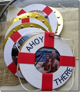
Hi, Patti here with another design team project.  this is a mini album I created using the Ahoy There collection from Carta Bella http://www.scrapadabadoo.com/item_7086/Carta-Bella-Ahoy-There-Collection.htm.  
Since I live in Florida I have a lot of photos of my grandsons either at the beach or in a boat on the lake and this collection was the perfect choice to document those memories.  I took my cue from the collection and wanted to create an album that replicated a life preserver.
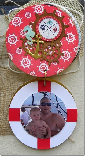
I started by cutting my cover using the Quickutz nesting circles dies using the 5.5” circle and the 2.75” circle in the center leaving a 1.25” rim to create a life preserver. If you don’t have the Quickutz dies any circle dies would work.  I then covered the covers with white craft tex http://www.scrapadabadoo.com/item_6484/Kraft-Tex-Paper-Fabric-White.htm.  I then wrapped (4) 1” strips in red around the white rope and the ring to recreate a life preserver.
Ahoy There 011
I then cut 6 more circles out for my pages alternating between the life preserver and the porthole look.
Ahoy There 014
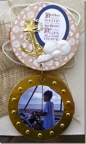
For the porthole pages, I used brass colored, mirrored cardstock cut with the 5.5” die then surrounded the page with brass brads http://www.scrapadabadoo.com/item_1769/AC-Medium-Brads-Gold.htm to complete the look.
Ahoy There 015
I embellished the pages opposite my photos with a variety of beachy die cuts http://www.scrapadabadoo.com/item_6528/MFT-Lets-Get-Nautical-Di.htmhttp://www.scrapadabadoo.com/item_7307/IO-Shell-Set-077.htm   and stickers from the collection.
Ahoy There 017
I left the photo pages unembellished and just adhered the photos using foam adhesive.  I think it helps to keep the focus on the photo.
 
Ahoy There 018
 
 
Ahoy There 019
I molded the seashell die cuts http://www.scrapadabadoo.com/item_7307/IO-Shell-Set-077.htm  much in the same way as you would die cut flowers using the McGill stylus http://www.scrapadabadoo.com/item_877/McGill-Tool-Paper-Blossoms-Tool-Kit-Case.htm and molding pad http://www.scrapadabadoo.com/item_878/McGill-Molding-Mat.htm to give added dimension.  I then lightly inked the edges with antique linen distress ink http://www.scrapadabadoo.com/item_1076/Ranger-Distress-Ink-Pad-Antique-Linen.htm then lightly sprayed them with pearl perfect pearls mist.
Ahoy There 022
I just used the cropadile to punch a hole and put in a brass binding ring to bind the book.
 
Thank you so much for looking.  ~Patti~

Saturday, July 26, 2014

WELCOME HOME

 
Hi, Patti here with another Scrapadabadoo design team project.   When Carol asked us what our favorite new Bo Bunny collection was I immediately answered with Somewhere in Time http://www.scrapadabadoo.com/item_6993/BoBunny-Somewhere-In-Time-Collection.htm.  I just love the blue, yellow, brown color combination…I think it’s my favorite although I don’t think I realized it until I was working with this gorgeous collection.
 
Somewhere in time 050

I started with matting my 12 x 12 background pages using the perfectly coordinated cardstock background sheets http://www.scrapadabadoo.com/item_7021/BoBunny-Somwhere-Cardtock-Pack.htm but because I have been known to be somewhat of a hoarder even though I just call it frugal, I gutted the back out of 2 of my mats.  What I did was cut out the centers leaving a 1” border.  This leaves me with some smaller squares that I can use for photo mats or making embellishments or whatever.
Somewhere in time 005
 
Working from the back upwards, this is my third layer.  I first cut 1/2" from one horizontal side and 1/2" from one vertical edge, then cut out a square leaving me with a 1" border.  I ended up with a 10.5" square remaining to use for future embellishments or matting.
 
You will see in a photo below that I chose a yellow piece of paper for my 2nd layer from the bottom. I trimmed a 1/4" off of one horizontal edge and 1/4" off of one vertical edge which left, then gutted out a square leaving a 1" border which left me with a 10.75 piece of paper for future embellishments.
 
Somewhere in time 006
Somewhere in time 007
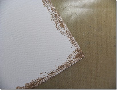
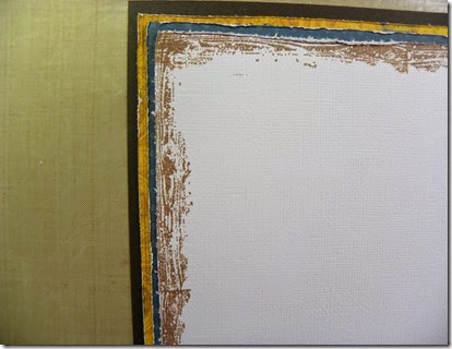
I chose a piece of white cardstock as the top layer of my layout so all of the other elements would pop off the page, but I thought it needed a little something to add interest so I stamped a border using the wood grain edge stamp from Kaisercraft http://www.scrapadabadoo.com/item_6513/Kaisercraft-Clear-Stamp-Edges.htm in Coffee Archival ink from Ranger http://www.scrapadabadoo.com/item_4088/Ranger-Archival-Ink-Coffee-Ink-Pad.htm
Somewhere in time 012
Before I adhered them all down, I distressed all the edges with the Prima Distressing Tool because I just can't help myself.
http://www.scrapadabadoo.com/item_5301/Prima-Distressing-Tool.htm
Somewhere in time 014
Somewhere in time 016
 
Once all of these layers are adhered, you will have a 1/8" border or mat all around.   I love the matted look on a page as I think it brings depth and dimension without adding too much bulk.   I need to save room for all the fun stuff like embellishments…tee hee hee.
 
Somewhere in time 020
 
Next is to anchor my photo.  I chose this section of one of the designer papers from the collection and added two strips of punched borders to the bottom to bring the background layers to the photo for a cohesive look.  This is where the leftover gutted pieces of paper come in handy.  Now I don’t have to cut into a perfectly good sheet of 12 x 12 cardstock for some embellishments.  I used the Martha Stewart eyelet lace edge punch to add interest to the borders.
 
Somewhere in time 022
 
I then decided the placement of my photo mat and decided towards the bottom was best since this was the largest element on the page and thought it would be too heavy to put in the upper section of the page.  I could have placed it in the center but then I wouldn’t have room for my embellishment cluster I had planned to balance out the page.
 
Somewhere in time 018
 
Here’s a little trick I like to do…I use a scrap piece of chipboard to mount my photo on just in the center of the photo so I can tuck embellishments under the photo after I’ve adhered it down.
 
I also do this to embellishments which you will see I did to the balloon.
 
Somewhere in time 023
 
Here are the embellishments I chose to complete my page.  The circle is an old piece of lasercut chipboard that I’ve had in my stash forever from back in the day when everyone was on a naked chipboard buying kick…well, maybe not everyone, but I certainly was and I have enough naked chipboard to open my own store.   But since I have no plans to open a store, I decided to try and incorporate a piece in every future project,  Wish me luck…


The remainder embellies are from the BoBunny Somewhere in time collection.   I just adored the vintage baby stroller and immediately knew what photo I was going to use in order to be able to incorporate it into my layout.
 
 
Somewhere in time 050
 
I completed the page by adding some of the jewels from the collection.
 
Thank you for having a look.  ~Patti~


Friday, July 18, 2014

PARADISE

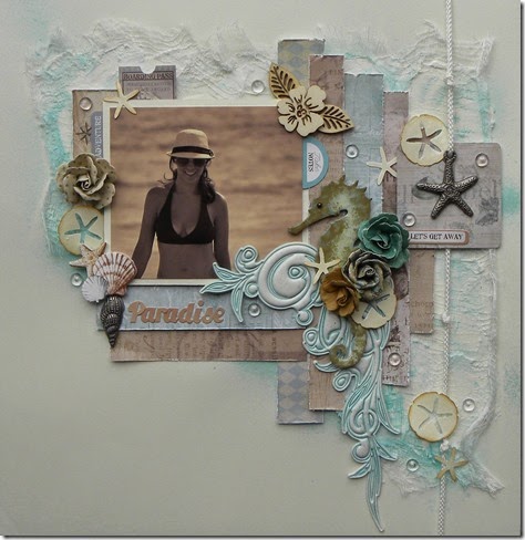
Hi everyone,  Here is another Scrapadabadoo design team project using the gorgeous Prima Seashore collection. http://www.scrapadabadoo.com/item_6922/Prima-Seashore-Collection-12-x-12.htm
 
 
Paradise 032
 
Paradise 002

When I start a project I typically gather my papers and all possible embellishments I want to use.  I like to sort them out using these divided trays.
 
Paradise 005
 
I was able to use an old piece I’ve had in my stash forever.  It’s from Pink Paislee Artisan collection.  I sprayed it using the Prima Color Bloom in Summer Sky. http://www.scrapadabadoo.com/item_6958/Prima-Color-Bloom-Summer-Sky.htm
 
Paradise 007
 
I then took a piece of cheesecloth and adhered it with some Golden’s light modeling paste then lightly misted with the same color bloom.
 
Paradise 008
 
After adding the modeling paste and the spray it warped my paper a little so I added some scor-tape to the back and adhered it to another sheet of 12 x 12 cardstock to help support my backgound paper.
 
Paradise 010
 
With my background all dried I then started with my layout design.  I started by cutting out several 1"strips of the patterned papers in various lengths overlapping them slightly.  I cut down my photo to 4.25 x 3.75 then matted it leaving a 1/8” border.
 
Paradise 012
 
I then started embellishing my page.  I started by threading this charm with some rope that I wrapped around the length of the page then taped it on the back.
 
Paradise 015
 
Paradise 011
 
Next I it was time to complete the look.  I painted the seahorse that I diecut from the new Tim Holtz Sand & Sea die.  I used 3 different colors, antique linen, salty ocean and frayed burlap to give the seahorse a more realistic look. I then added some crackle accents http://www.scrapadabadoo.com/item_982/Ranger-Crackle-Accents-Mini-.5-oz.htm to complete the look.
Paradise 017
 
Paradise 032
 
I then went to town with embellishments.  I was going to attempt my hand at a negative space layout and thought this collection lent itself to be light and airy, but I just couldn’t leave well enough alone.  I started tucking tickets and stickers from the collection http://www.scrapadabadoo.com/item_6926/Prima-Seashore-Tags-Tickets.htm here and there.  I also scattered some flowers around http://www.scrapadabadoo.com/item_6927/Prima-Seashore-Sea-Lion-Flowers.htm.  I then added some punched sand dollars using a Martha Stewart punch. I completed the page by sprinkling around some dew drops that I’ve had in my stash. It feels good to use some things I've had and mix it up with new products.
 
Thank you very much for looking.